Mastering Z Image in ComfyUI — The Ultimate Guide to Samplers & Schedulers
Z Image has exploded in popularity as a text-to-image model: it’s fast, sharp, and shockingly realistic. Many creators are already saying it outshines even newer models like Flux 2 and Nano Banana Pro.
But here’s the catch: Most people are not using Z Image anywhere near its full potential.
If you stick to the same old, basic samplers and schedulers, you’ll often end up with images that all look… the same.
In this article, I’ll walk you through what actually matters for Z Image inside ComfyUI: which samplers and schedulers to use, how they affect quality and diversity, and how to automatically test tons of combinations with the Lumi Batcher custom node.
By the end, you’ll know exactly how to push Z Image much harder than “default settings” ever will.
Why Default Settings Make Z Image Look Boring
When most people load up Z Image, they:
- Keep the default sampler (often basic Euler),
- Pair it with a common scheduler, and
- Change nothing except the seed.
On paper, that sounds like variety. In practice? Not really.
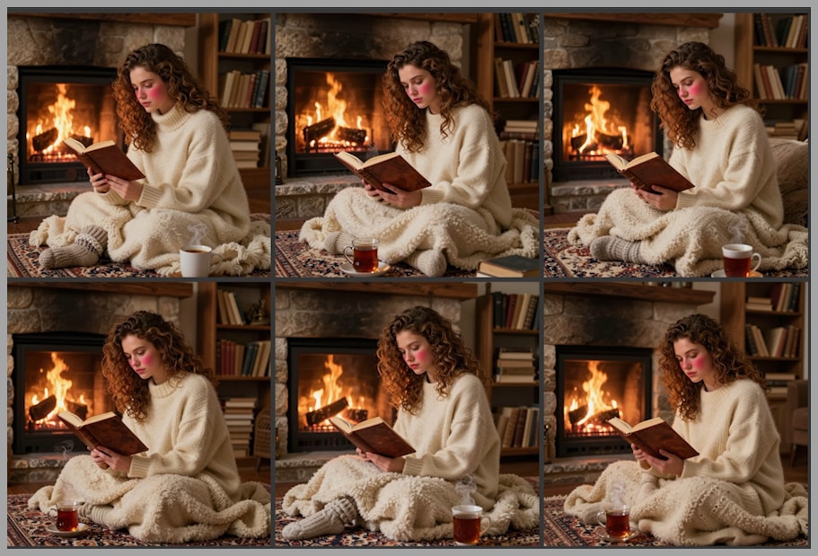
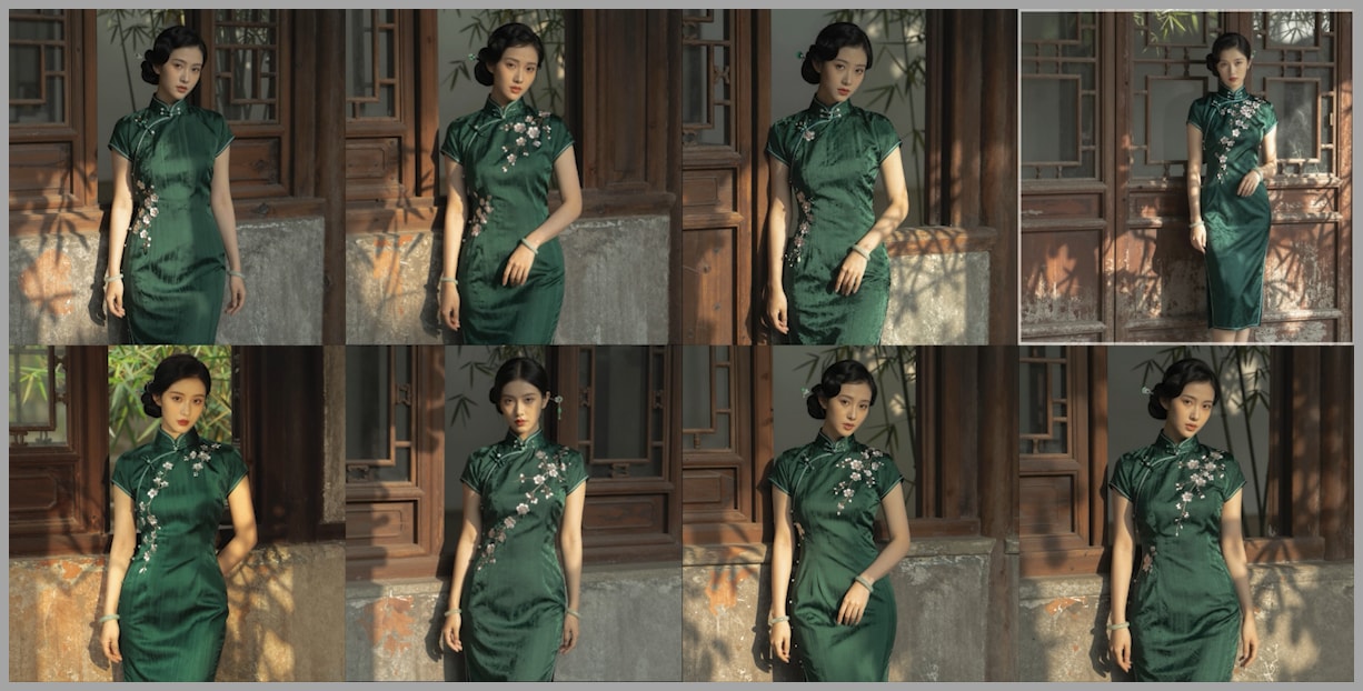
For example, imagine generating a batch of six images using Z Image:
- Same prompt
- Different seeds
- Default sampler and scheduler
You’d expect these six images to look quite different. Instead, they often look almost identical: similar lighting, similar composition, similar details. This is a sign that the sampler–scheduler combo is bottlenecking your creativity.
To break out of that sameness, we need to get serious about experimentation.
The Experiment: 560 Images, 140 Combinations
To truly understand how Z Image behaves, I ran a large-scale test:
- 14 different samplers
- 10 different schedulers
- 4 distinct prompt scenarios (to cover a variety of use cases)
- All combinations tested → 14 × 10 = 140 per scenario
- Total images generated → 140 × 4 = 560 images
- Resolution: 1792 × 1792
- Z Image can go higher (e.g., 2048), but 1792² is more than enough to clearly compare quality.
Every single image was rendered using Z Image inside ComfyUI with carefully controlled settings so differences came only from sampler and scheduler choices. I then evaluated all 560 images and logged the results in a spreadsheet.
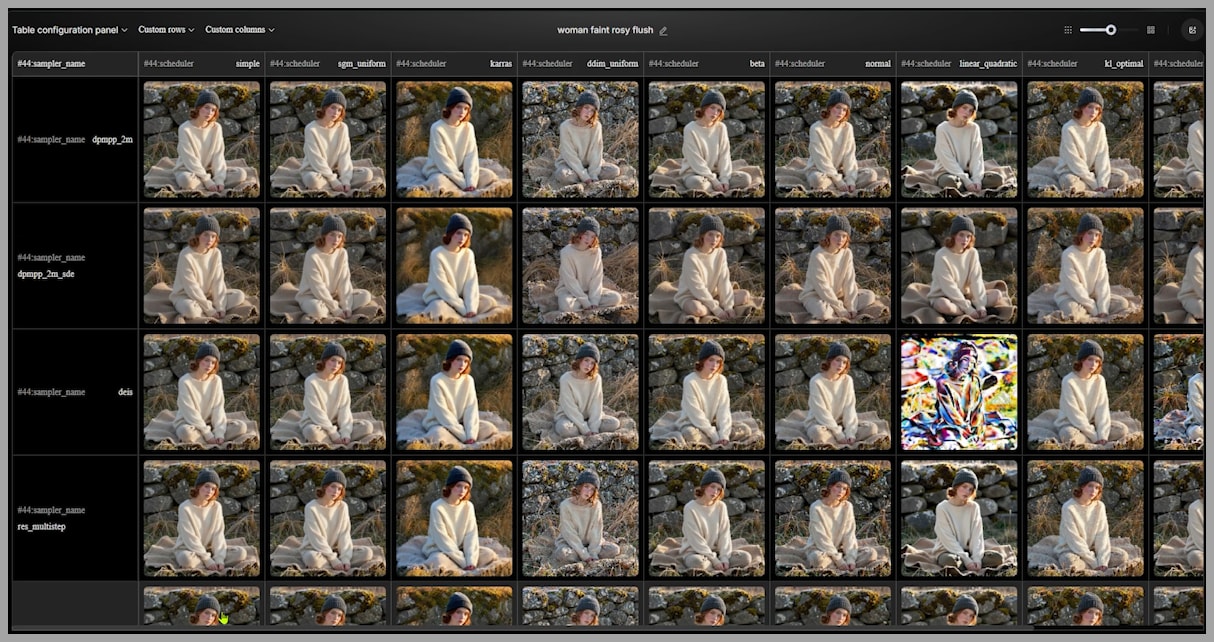
In this article, I’ll share the most important findings from that testing.
Stop Relying on Basic Euler: Better Samplers for Z Image
Let’s start with the biggest, fastest win:
First big tip: stop relying on the basic Euler sampler.
Euler definitely works and is widely used, but Z Image responds much better to:
- DPMPP SDE
- Euler Ancestral
Both of these samplers consistently produced sharper, cleaner, and more natural images in the tests.
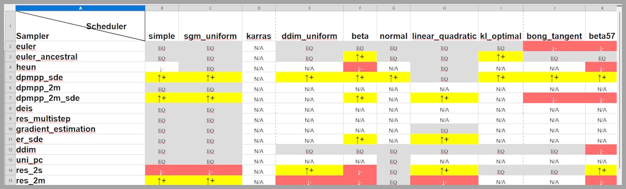
Your Cheat Sheet: The Four Best Combinations
From all 140 combinations, here’s the “quick win” table you’ll want to remember.
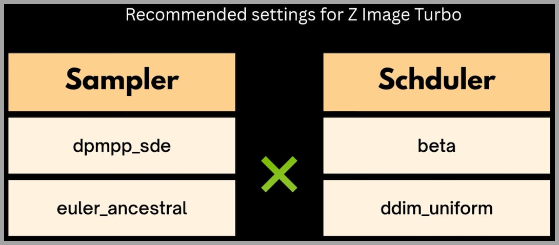
We’ll mainly work with:
- Samplers
- DPMPP SDE
- Euler Ancestral
- Schedulers
- Beta
- DDIM Uniform
That already gives us 4 “golden” combinations:
- DPMPP SDE + Beta
- DPMPP SDE + DDIM Uniform
- Euler Ancestral + Beta
- Euler Ancestral + DDIM Uniform
These combos frequently delivered the best balance of:
- Detail and clarity
- Texture realism
- Diversity between images
Whenever you’re not sure what to use with Z Image in ComfyUI, start with one of these four.
YouTube Tutorial:
Gain exclusive access to advanced ComfyUI workflows and resources by joining our community now!
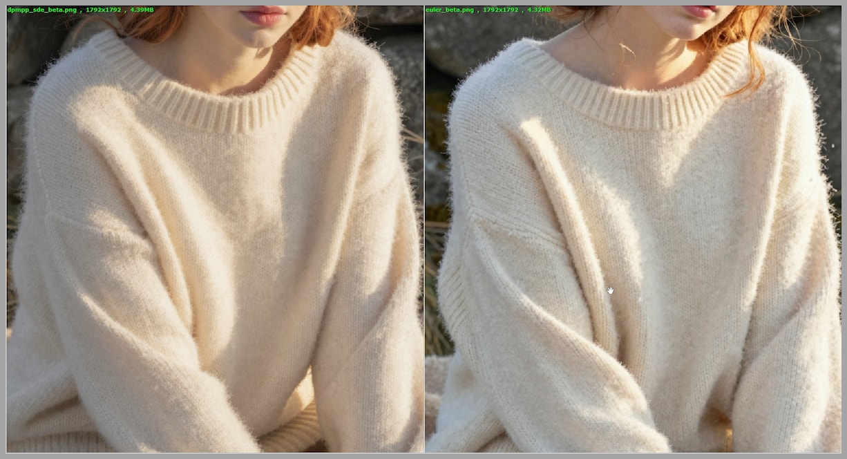
DPMPP SDE vs. Euler: A Close-Up Quality Battle
To really understand why DPMPP SDE is recommended over basic Euler, let’s compare them in more detail. In the experiment, both samplers were paired with the Beta scheduler, using the same prompt and similar seeds.
Knitted Hat and Clothing Details
In one test image, the subject wears a knitted hat and sweater:
- DPMPP SDE
- The knitted hat has a clear, structured pattern.
- The sweater looks cozy and fluffy, with a believable fabric texture.
- Euler
- The knit structure is less defined, slightly mushier.
- The edge of a blanket in the scene has small but noticeable flaws.
These are subtle differences, but they matter when you want images that look handcrafted instead of “AI-ish.”
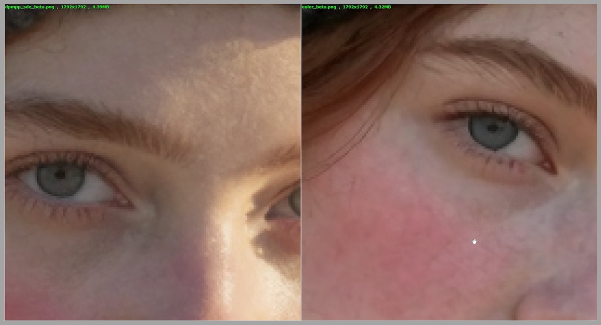
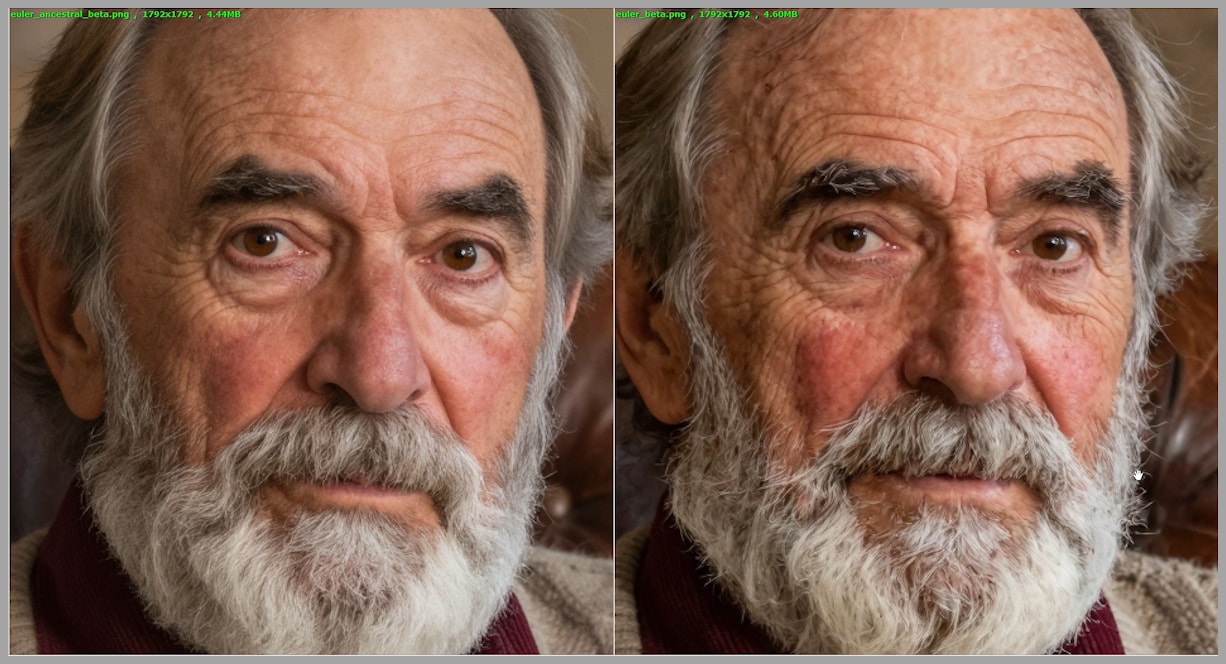
Facial Features: Eyes, Skin, and Teeth
Zooming in on the face reveals even more:
- Eyes
- With DPMPP SDE, the pupil is more perfectly round and natural.
- With Euler, the pupil shape can look slightly irregular.
- Stray Hair & Skin
- On DPMPP SDE: loose hairs look like actual hair strands.
- On Euler: the area near the cheek and ear can look confusing—almost like veins under the skin instead of hair.
- Teeth
- DPMPP SDE yields crisper, better-separated teeth.
- Euler tends to blur these subtle details together.
Put simply, for fine detail and structure, DPMPP SDE clearly has the edge.
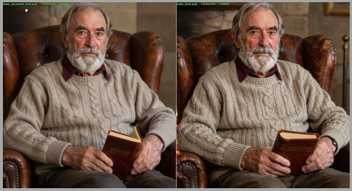
Elderly Portraits: Texture vs. Artifacts
In another comparison, I looked at portraits of elderly men:
- Sweater Texture
- DPMPP SDE: the knitted structure is sharply defined and realistic.
- Euler: the pattern is present, but more washed out.
- Skin & Forehead
- DPMPP SDE avoids weird artifacts and keeps skin texture more believable.
- Euler can introduce issues in the forehead area that look like rendering errors rather than natural wrinkles.
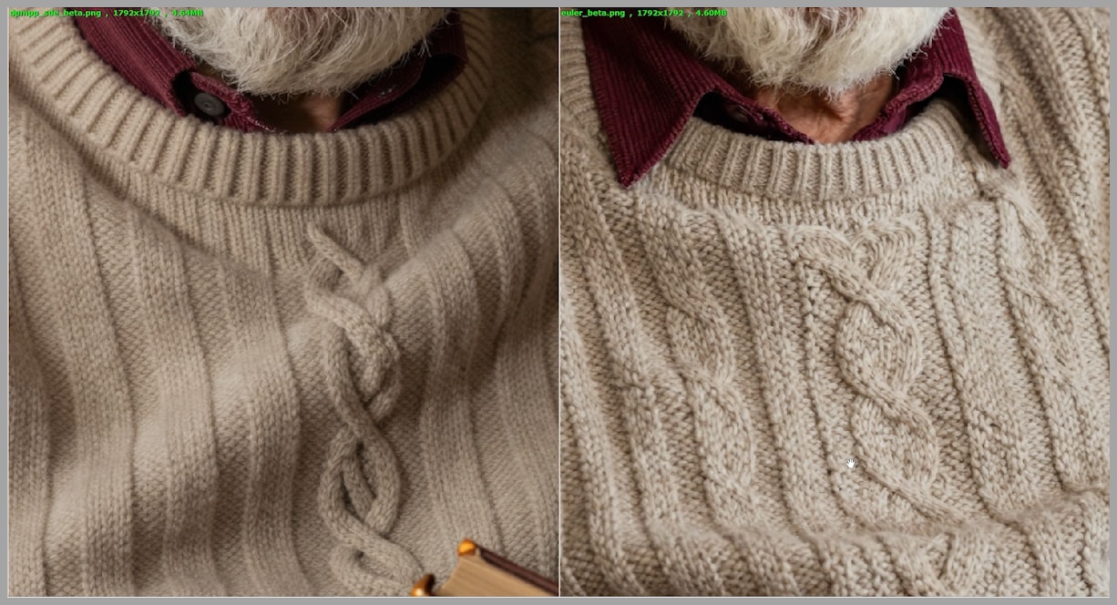
If you care about high-quality portrait work, especially with Z Image, DPMPP SDE is a standout choice.
Diversity: DPMPP SDE vs. Euler
Quality isn’t the only factor—diversity matters too.
When I generated batches of images with DPMPP SDE using different schedulers, even when the poses were similar, each image still felt distinct:
- Lighting shifted in interesting ways
- Background elements changed
- Subtle differences in expression and mood appeared
The result? A batch of images that genuinely felt like variations on a theme.
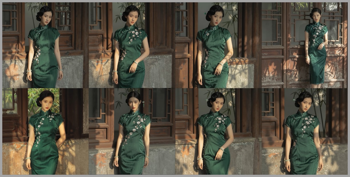
Meanwhile, using Euler across schedulers often produced almost cloned images:
- Very similar compositions
- Nearly identical lighting
- Minor differences that were hard to even spot
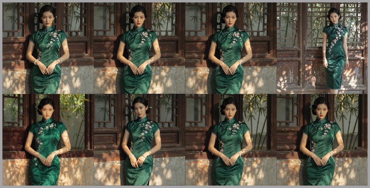
If your goal is to explore creative variations with Z Image, DPMPP SDE gives you much richer diversity.
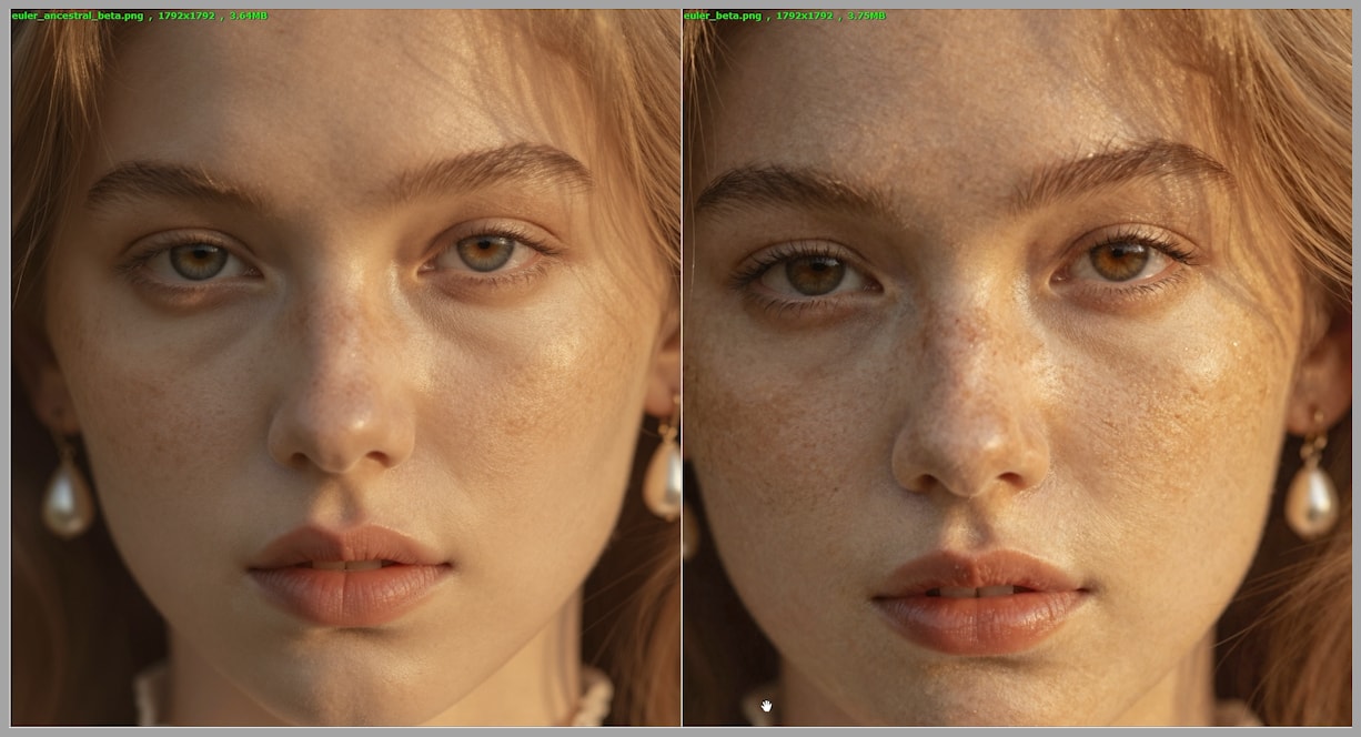
Euler Ancestral: Ultra-Smooth Skin and Delicate Detail
Now, let’s talk about Euler Ancestral.
In one test, I compared:
- Left image: Euler Ancestral + Beta
- Right image: basic Euler + Beta
At first glance, the pose, face angle, and overall composition were quite similar. But zooming in on the face told a very different story.
Skin Texture and Overall Smoothness
- Euler Ancestral
- Skin appears smoother and more natural.
- Details feel carefully polished rather than over-sharpened.
- Euler
- Skin can look slightly rougher or more artificial.
This “beautifying” effect from Euler Ancestral doesn’t just affect skin. It subtly improves:
- The texture of sweaters
- The surface of objects like the sofa in the background
- Small, fine details across the entire image
When to Use (and Not Use) Euler Ancestral
The ultra-smooth effect is a double-edged sword:
- Great for:
- Portraits of younger women
- Beauty, fashion, or glamour-style images
- Scenes where you want a soft, polished look
- Less ideal for:
- Aging skin, where smoothing can look unnatural
- Gritty, realistic character portraits that need pronounced texture
In other words, use Euler Ancestral when you want a polished, soft, aesthetically pleasing look, especially in portraits. For realistic elderly skin texture, DPMPP SDE is usually safer.
Schedulers: Why Beta and DDIM Uniform Shine
So far, we’ve focused mostly on samplers. But schedulers are just as important.
While DPMPP SDE, Euler, and Euler Ancestral work with many schedulers, I consistently found that two schedulers really unlock their power:
- Beta
- DDIM Uniform
Other schedulers are certainly usable and sometimes produce decent results, but Beta and DDIM Uniform were the ones that:
- Enhanced texture and detail
- Helped samplers behave more consistently
- Produced images that felt more “alive” and less flat
This is why, in the cheat sheet earlier, I specifically recommended mixing:
- DPMPP SDE + Beta
- DPMPP SDE + DDIM Uniform
- Euler Ancestral + Beta
- Euler Ancestral + DDIM Uniform
If you want a short list of “just use these,” this is it.
DDIM Uniform’s Unique Look
Among all the schedulers tested, DDIM Uniform stood out for how noticeably it can change the resulting image.
In one set of eight images generated with:
- Sampler: DPMPP SDE
- Various schedulers
Only one image in the grid was a three-quarter portrait, while the rest were half-body portraits. That odd one out—the one that changed composition more significantly—used DDIM Uniform.
The same pattern repeated in another set:
- The top-right image looked distinct again compared to the others.
- Different pose, slightly different composition, more variation in how the subject was framed.

This suggests that DDIM Uniform doesn’t just tweak texture—it can meaningfully shift pose and composition, making its images easier to distinguish from the rest of the batch.
If you feel your results are too “same-y,” pairing DPMPP SDE or Euler Ancestral with DDIM Uniform is a great way to shake things up.
Automating Experiments with Lumi Batcher in ComfyUI
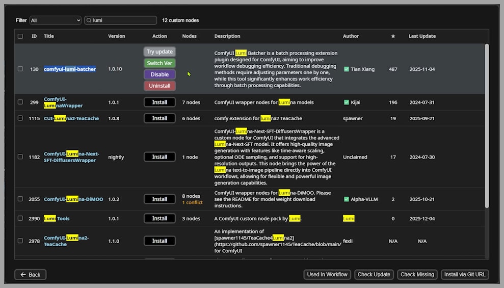
Testing 14 samplers and 10 schedulers manually would be a nightmare. That’s where Lumi Batcher, a powerful custom node for ComfyUI, comes in.
Installing Lumi Batcher
- Open ComfyUI.
- Go to the ComfyUI Manager.
- In the search bar, type:
Lumi - Install the node called “Lumi Batcher”.
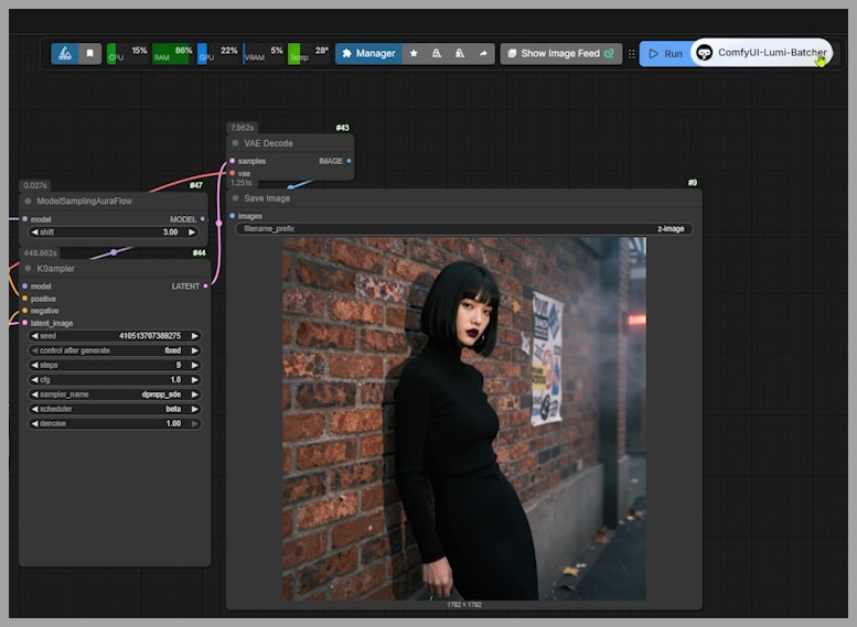
After installation:
- A floating button appears in the top-right corner of your ComfyUI workspace.
- Click this button to open the Lumi Batcher interface.
First Steps with Lumi Batcher
Inside the Lumi Batcher interface, you’ll see options like:
- New Task – to create a fresh batch job
- Assistance for Beginner – to open the documentation if you’re just starting out
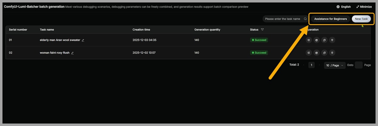
If you’re new to it, I recommend clicking “Assistance for Beginner” once to quickly understand the basics of how Lumi Batcher organizes tasks.
Results, Resources, and Where to Go Next
After generating all 560 images, I carefully evaluated each result and logged:
- Which sampler–scheduler combos were most stable
- Where artifacts appeared
- Which combinations gave the best balance of quality and diversity
These observations are compiled in a spreadsheet, along with the full set of 560 images.
RESOURCES:
- Full 560-image comparison dataset
- Evaluation spreadsheet
Join Our Community for Resources:
Gain exclusive access to advanced ComfyUI workflows and resources by joining our community now!