Charting the Future: How to Use ChatGPT to Draw Graphs and Charts
ChatGPT, OpenAI’s cutting-edge language model, is no longer just a marvel of text generation—it’s also your new best friend in the world of data visualization.
In this article, we’ll explore 4 versatile techniques that every ChatGPT user, regardless of subscription status, can utilize to transform data into compelling, easy-to-understand visuals.
Prepare to open new doors of insight and communication, because the future of data is not only about numbers—it’s also about telling a story.
Using Code Interpreter
OpenAI’s Code Interpreter, an extension for ChatGPT, elevates the AI’s capacity to pen Python code, particularly for data analysis and visualization. Python is well-known for its prowess in these areas.
Code Interpreter shines in its ability to upload files directly. It’s a breeze to upload various file formats, including Excel, CSV, PDF, and others, to ChatGPT for analysis. From crafting simple Excel visuals to undertaking intricate machine learning models, it’s all achievable through conversations.
In a previous article, I’ve used a Kaggle dataset to try out various data analysis techniques with Code Interpreter.
It went beyond my expectations by automatically producing graphs aligned with my analysis goals, even though I didn’t specifically ask for them. Plus, you can interact with Code Interpreter to generate and tweak charts to your liking.
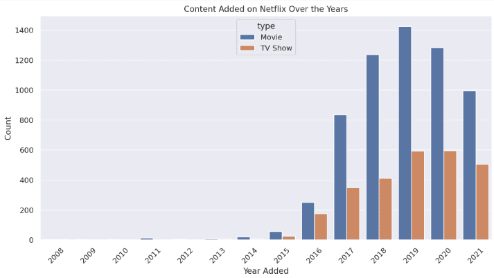
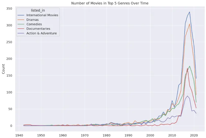
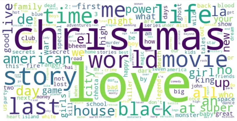
Here are some sample graphs I created:
Histogram:
Line chart:
Word cloud:
Heat map:
Using “Show Me Diagrams” ChatGPT Plugin
ChatGPT Plus users can use the Show Me Diagrams plugin to create many graphic types, including bar, line, and scatter charts, streamgraphs, circular plots, box plots, maps, and more. With this plugin, you can also draw diagrams for system and process visualization like flowcharts and mind maps.
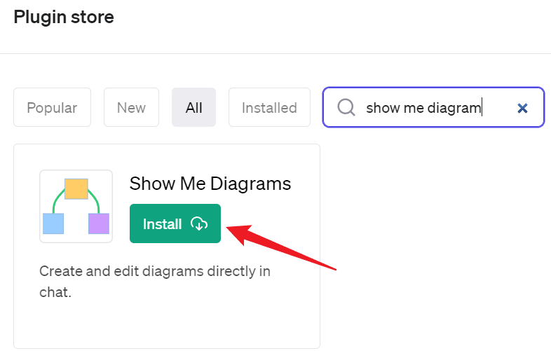
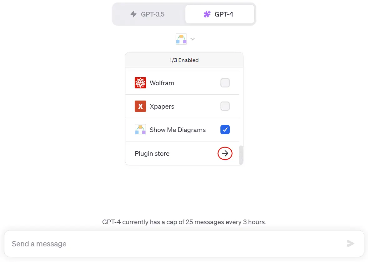
To use it, ensure that the ChatGPT plugin feature is activated.
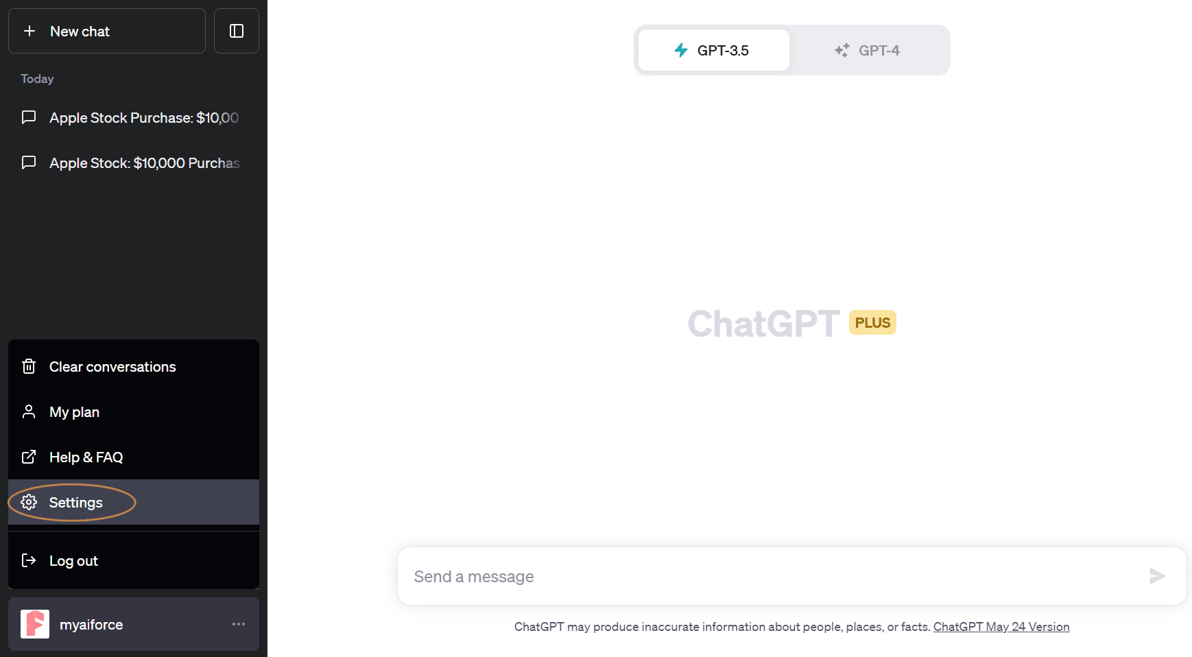
Visit the ChatGPT Plugin Store, search for the plugin, and click “Install”.
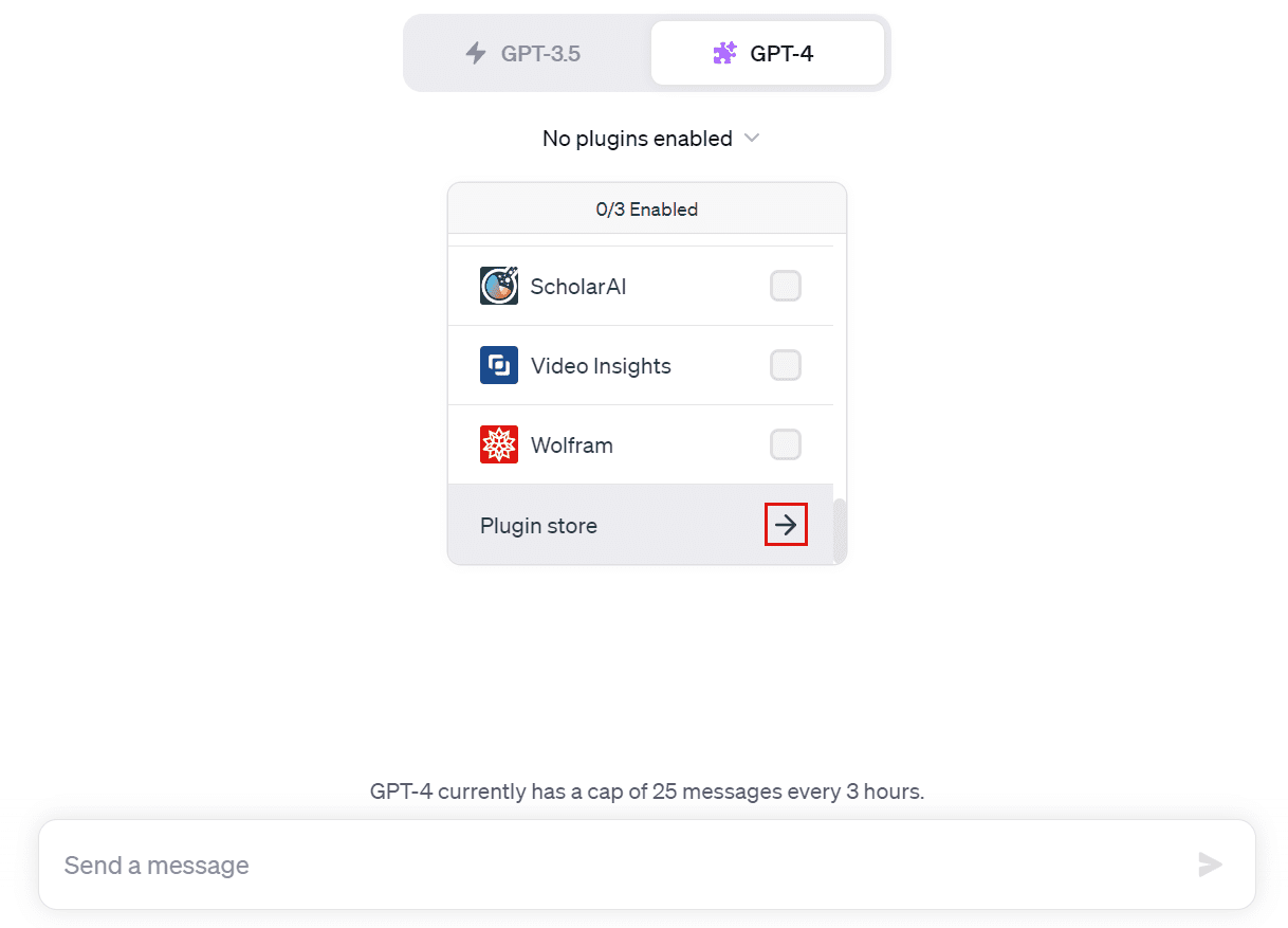
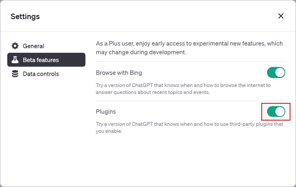
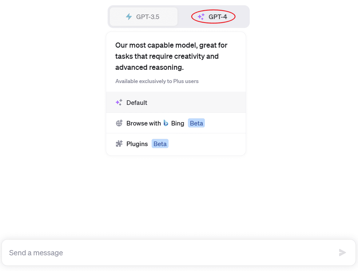
After installation, switch to ChatGPT4 and access the “Plugins” button from the “GPT-4” drop-down menu.
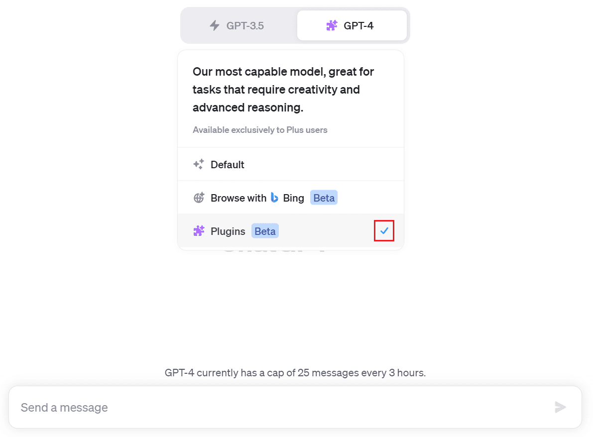
Check the “Show Me Diagrams” plugin.
Then enter your prompt. I will use this sample table for demonstration.
| Date | Product | Product Category | Units Sold | Revenue |
|---|---|---|---|---|
| 7/1/2023 | Apple | Fruits | 10 | $15.00 |
| 7/2/2023 | Banana | Fruits | 20 | $12.00 |
| 7/3/2023 | Orange | Fruits | 15 | $10.50 |
| 7/4/2023 | Tomato | Vegetables | 12 | $18.00 |
| 7/5/2023 | Potato | Vegetables | 25 | $20.00 |
| 7/6/2023 | Carrot | Vegetables | 18 | $14.40 |
| 7/7/2023 | Peach | Fruits | 8 | $11.20 |
| 7/8/2023 | Watermelon | Fruits | 5 | $25.00 |
| 7/9/2023 | Cucumber | Vegetables | 30 | $22.50 |
| 7/10/2023 | Apple | Fruits | 12 | $18.00 |
| 7/11/2023 | Banana | Fruits | 22 | $13.20 |
| 7/12/2023 | Orange | Fruits | 17 | $11.90 |
| 7/13/2023 | Tomato | Vegetables | 10 | $15.00 |
| 7/14/2023 | Potato | Vegetables | 28 | $22.40 |
| 7/15/2023 | Carrot | Vegetables | 16 | $12.80 |
| 7/16/2023 | Peach | Fruits | 6 | $8.40 |
| 7/17/2023 | Watermelon | Fruits | 7 | $35.00 |
| 7/18/2023 | Cucumber | Vegetables | 35 | $26.25 |
| 7/19/2023 | Apple | Fruits | 11 | $16.50 |
| 7/20/2023 | Banana | Fruits | 21 | $12.60 |
| 7/21/2023 | Orange | Fruits | 16 | $11.20 |
| 7/22/2023 | Tomato | Vegetables | 11 | $16.50 |
| 7/23/2023 | Potato | Vegetables | 30 | $24.00 |
| 7/24/2023 | Carrot | Vegetables | 20 | $16.25 |
| 7/24/2023 | Carrot | Vegetables | 20 | $16.00 |
| 7/25/2023 | Peach | Fruits | 9 | $12.60 |
| 7/26/2023 | Watermelon | Fruits | 8 | $40.00 |
| 7/27/2023 | Cucumber | Vegetables | 40 | $30.00 |
| 7/28/2023 | Apple | Fruits | 14 | $21.00 |
| 7/29/2023 | Banana | Fruits | 25 | $15.00 |
| 7/30/2023 | Orange | Fruits | 20 | $14.00 |
| 7/31/2023 | Carrot | Vegetables | 30 | $24.00 |
This table illustrates the sales data of vegetable and fruit products for July 2023, which includes the Date, Product, Product Category, Units Sold, and Revenue.
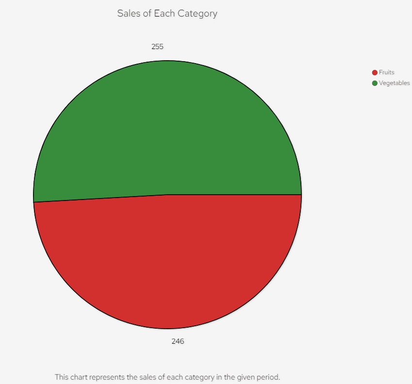
First, I copied and pasted the table directly from Excel into ChatGPT and asked it to draw a pie chart showing the sales of each category for me:
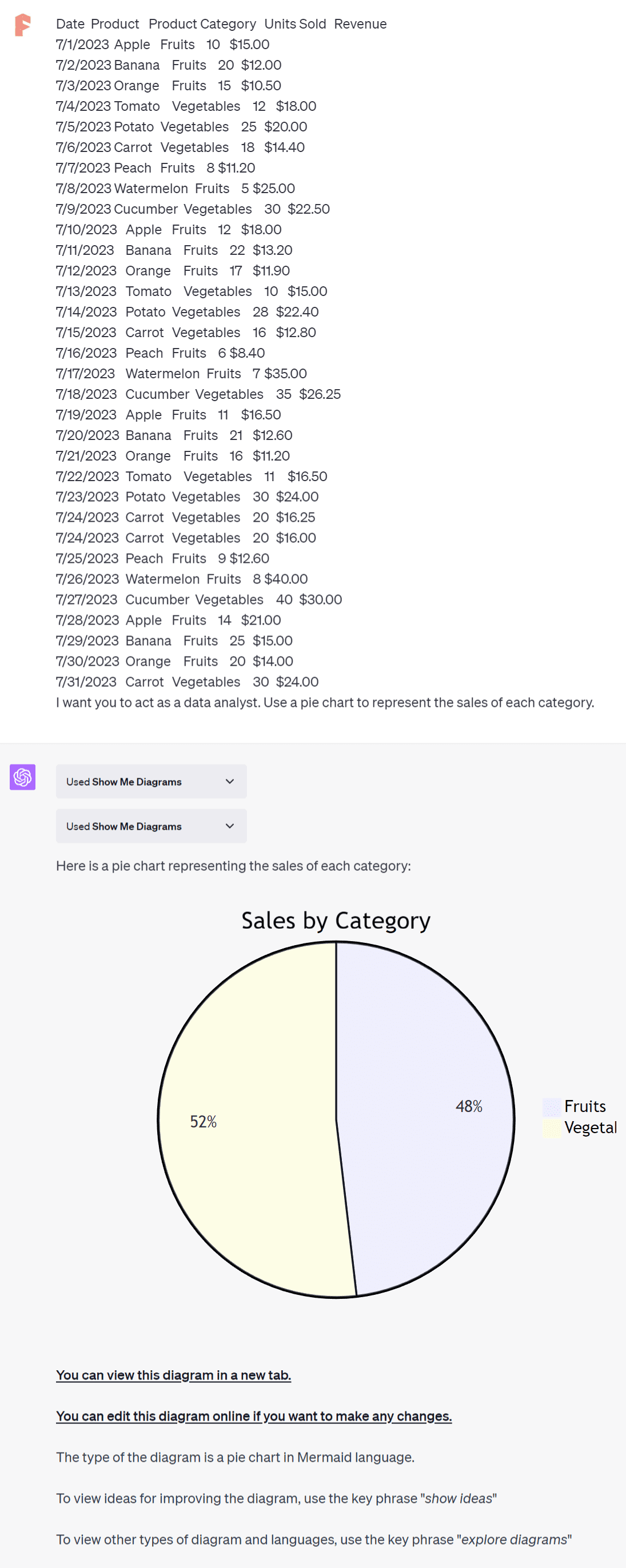
You can view this diagram in a new tab by clicking the hyperlinks in ChatGPT’s response.
You can also click the text hyperlink “You can edit this diagram online if you want to make any changes” to edit the pie chart in a new tab.
An online editor will open, displaying the pie chart’s code on the left side.
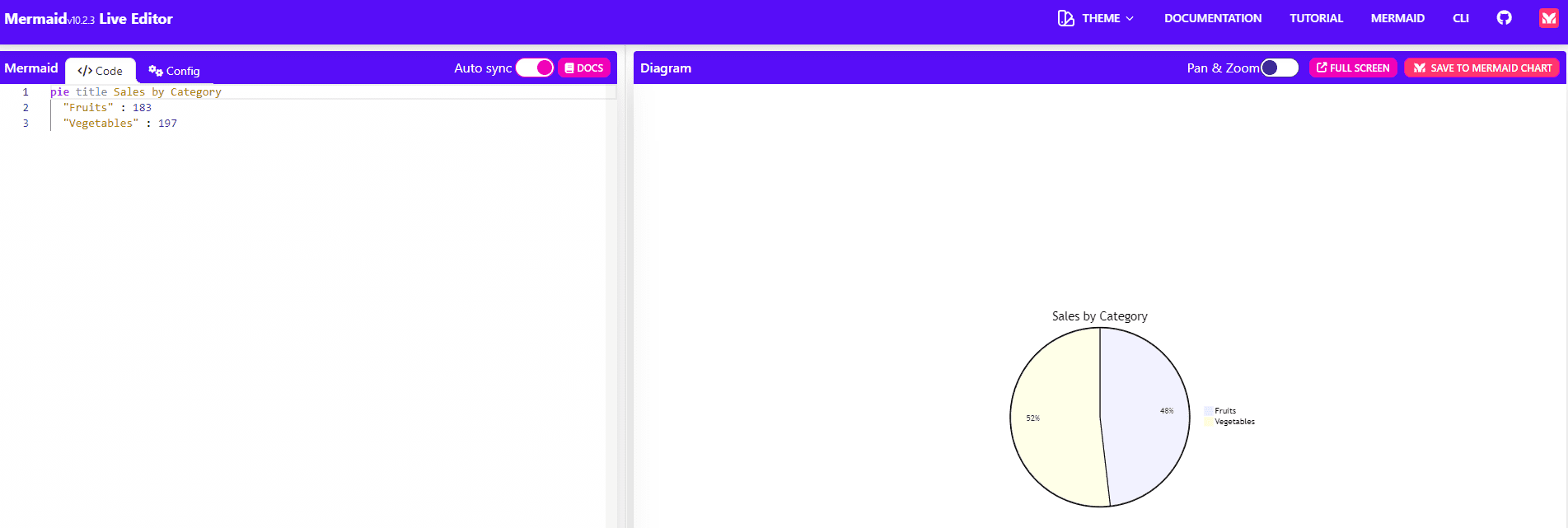
You can modify the pie chart by changing the code. If you’re not familiar with the Mermaid language, you can ask ChatGPT to modify the pie chart according to your preferences.
Let’s generate another chart. I asked ChatGPT to create a bar chart that illustrates the total sales of each product. Here is its response:
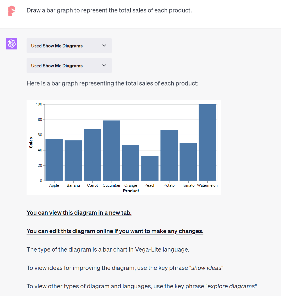
Similarly, you can open a new tab to view or edit this bar chart online.
Using “Daigr.am” ChatGPT Plugin
Just like the Show Me Diagrams plugin, Daigr.am also enables the creation of various charts. Instructions on how to install and activate it can be found under the Show Me Diagrams subsection. I’ll input the same prompt as before into ChatGPT to see what Daigr.am can generate.
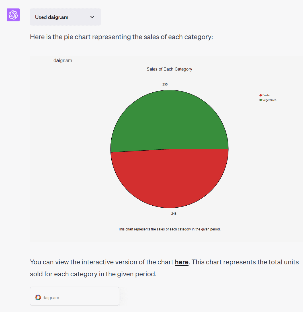
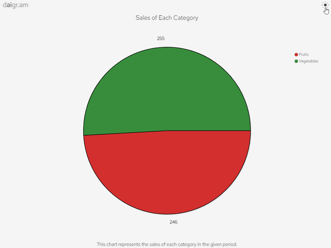
You can save the resulting pie chart as an SVG image by right-clicking on it. Clicking the hyperlinked “here” will open the pie chart in a new tab, which offers dynamic color changes when hovering over different sections.
Another cool feature is the dark mode, toggled by clicking on the sun icon at the top right.
Let’s also have ChatGPT generate a line chart to depict daily sales trends.
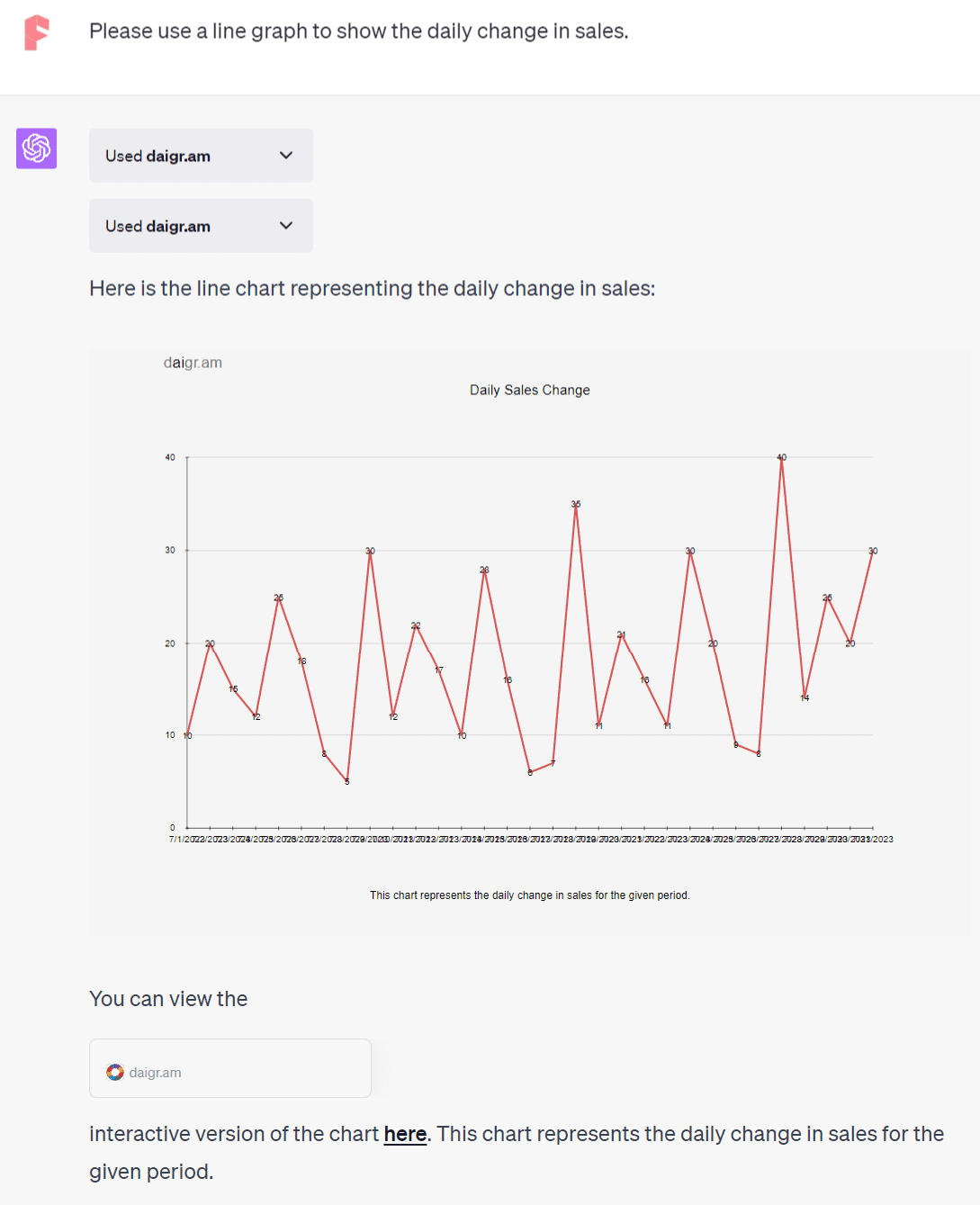
Click on the “here” hyperlink again to view this in a new tab.
Leveraging the ChatGPT Wolfram Plugin
Wolfram is another ChatGPT plugin that generates charts, albeit as a secondary feature. It’s capable of complex mathematical calculations and answering specialized questions. I’ve covered this in a previous article.
Let’s use a prior table and have Wolfram generate a pie chart from it.
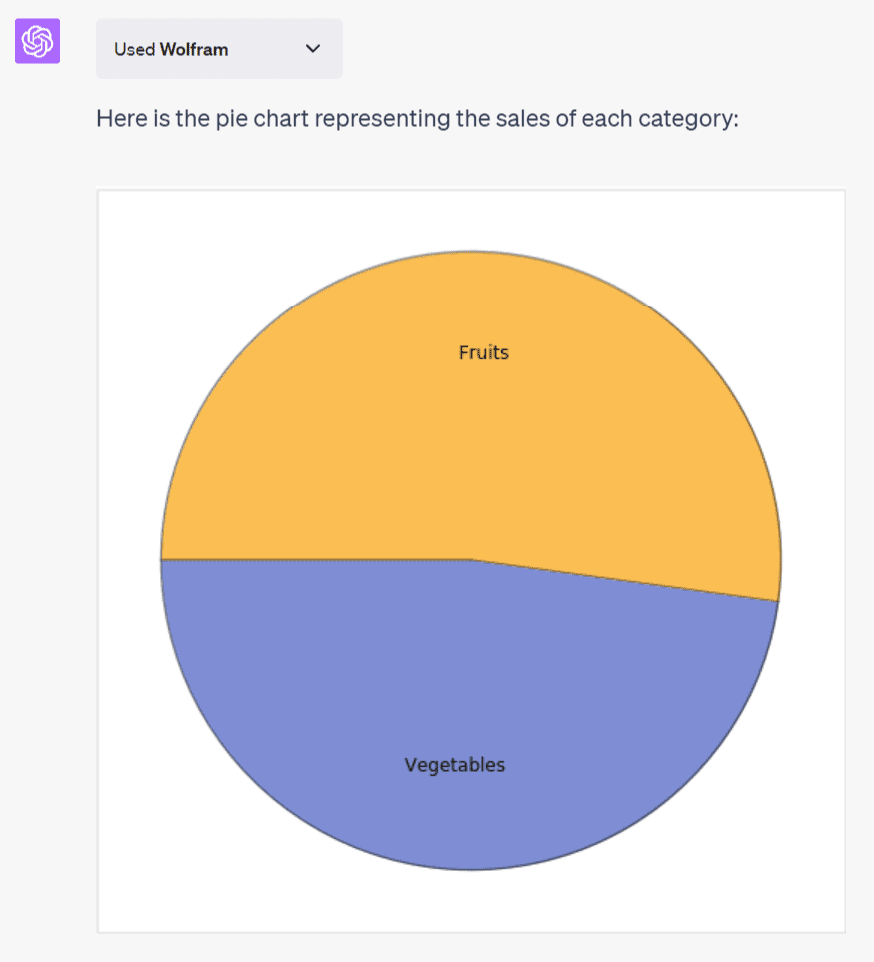
The result is a basic pie chart, lacking sales data or category percentages. The image can be saved by right-clicking on it. Next, we’ll have it generate a line chart.
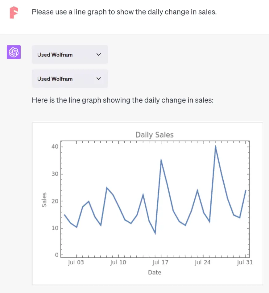
Though the line chart from Wolfram is somewhat crude and lacks daily sales data compared to Daigr.am, Wolfram’s strength lies elsewhere.
For example, when asked about China and the US’s population growth and rates over the past 50 years, it gave two line graphs from 1970-2021.
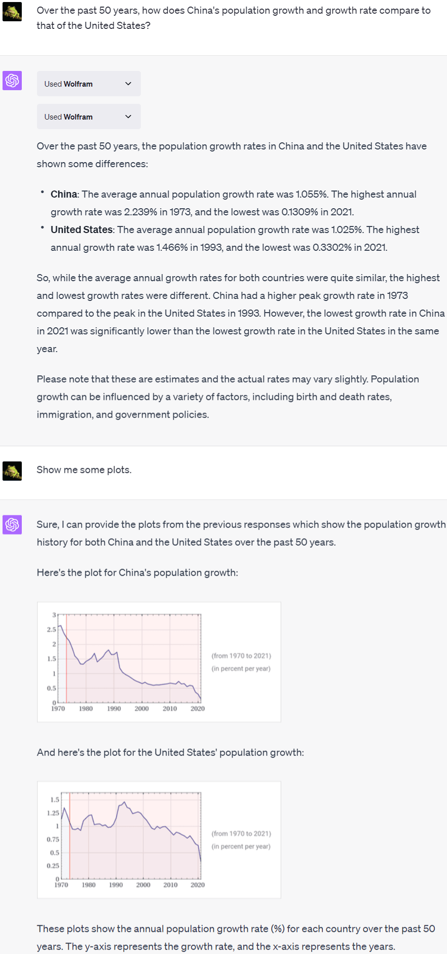
ChatGPT with Daigr.am, however, could only provide a general text description. It suggested checking the historical data from reliable sources like the World Bank or the UN population database for more accurate information.
Wolfram’s power lies in its ability to tap into numerous reliable specialized databases, covering topics like demographics, economics, sociology, and more. If you need data-based charts in your field, this is the plugin to use.
Getting ChatGPT to Generate Code for Charts
The previous methods are only available to Plus users via the ChatGPT plugins. However, anyone can generate charts with ChatGPT. Let’s see how through another example. I still copied and pasted the previous table directly into ChatGPT and asked it to create a pie chart to represent the total sales of the two categories.
| Date | Product | Product Category | Units Sold | Revenue |
|---|---|---|---|---|
| 7/1/2023 | Apple | Fruits | 10 | $15.00 |
| 7/2/2023 | Banana | Fruits | 20 | $12.00 |
| 7/3/2023 | Orange | Fruits | 15 | $10.50 |
| 7/4/2023 | Tomato | Vegetables | 12 | $18.00 |
| 7/5/2023 | Potato | Vegetables | 25 | $20.00 |
| 7/6/2023 | Carrot | Vegetables | 18 | $14.40 |
| 7/7/2023 | Peach | Fruits | 8 | $11.20 |
| 7/8/2023 | Watermelon | Fruits | 5 | $25.00 |
| 7/9/2023 | Cucumber | Vegetables | 30 | $22.50 |
| 7/10/2023 | Apple | Fruits | 12 | $18.00 |
| 7/11/2023 | Banana | Fruits | 22 | $13.20 |
| 7/12/2023 | Orange | Fruits | 17 | $11.90 |
| 7/13/2023 | Tomato | Vegetables | 10 | $15.00 |
| 7/14/2023 | Potato | Vegetables | 28 | $22.40 |
| 7/15/2023 | Carrot | Vegetables | 16 | $12.80 |
| 7/16/2023 | Peach | Fruits | 6 | $8.40 |
| 7/17/2023 | Watermelon | Fruits | 7 | $35.00 |
| 7/18/2023 | Cucumber | Vegetables | 35 | $26.25 |
| 7/19/2023 | Apple | Fruits | 11 | $16.50 |
| 7/20/2023 | Banana | Fruits | 21 | $12.60 |
| 7/21/2023 | Orange | Fruits | 16 | $11.20 |
| 7/22/2023 | Tomato | Vegetables | 11 | $16.50 |
| 7/23/2023 | Potato | Vegetables | 30 | $24.00 |
| 7/24/2023 | Carrot | Vegetables | 20 | $16.25 |
| 7/24/2023 | Carrot | Vegetables | 20 | $16.00 |
| 7/25/2023 | Peach | Fruits | 9 | $12.60 |
| 7/26/2023 | Watermelon | Fruits | 8 | $40.00 |
| 7/27/2023 | Cucumber | Vegetables | 40 | $30.00 |
| 7/28/2023 | Apple | Fruits | 14 | $21.00 |
| 7/29/2023 | Banana | Fruits | 25 | $15.00 |
| 7/30/2023 | Orange | Fruits | 20 | $14.00 |
| 7/31/2023 | Carrot | Vegetables | 30 | $24.00 |
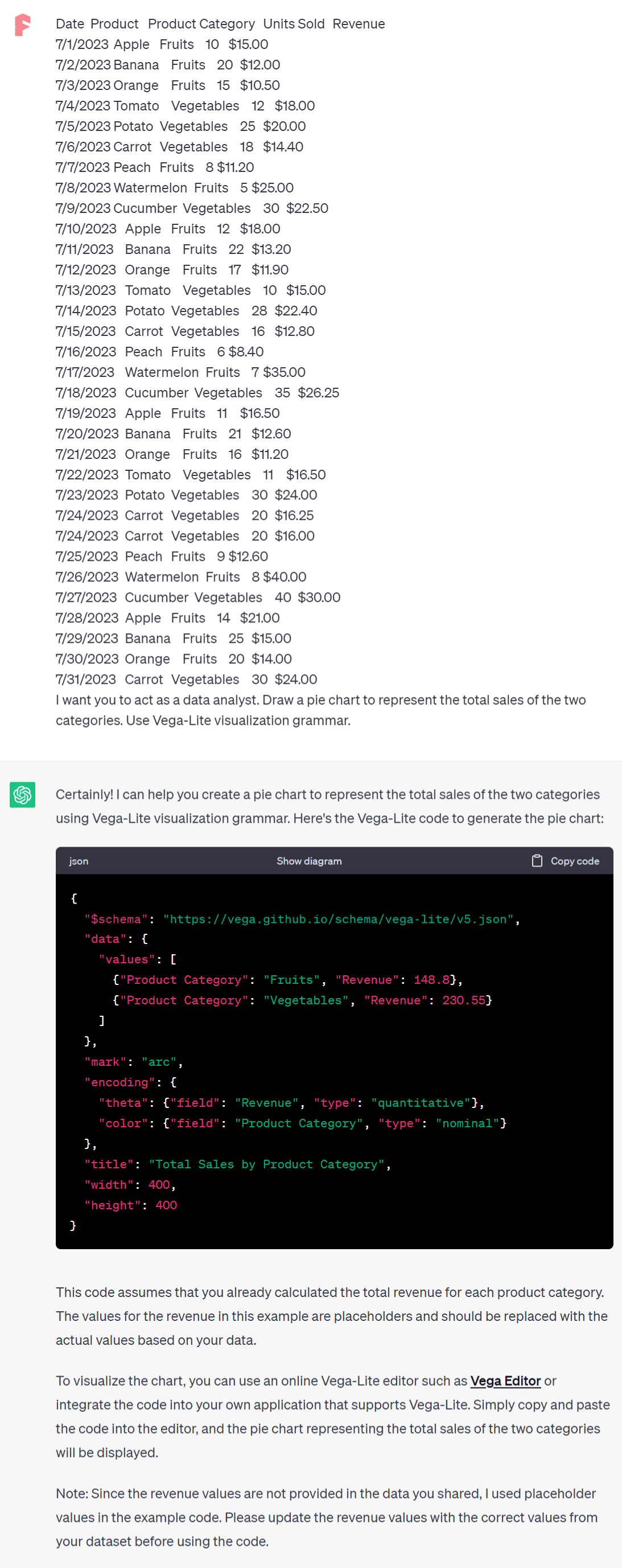
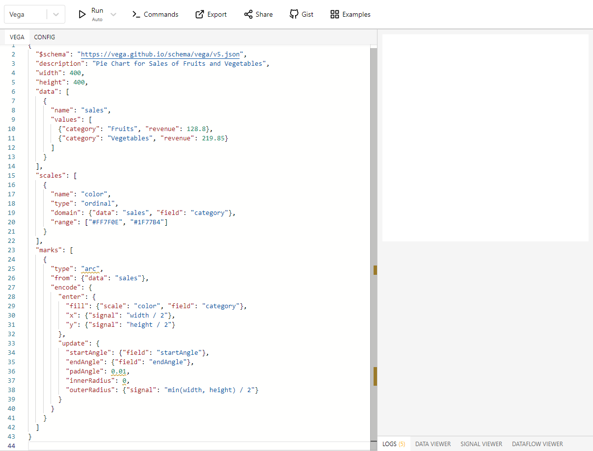
Prompt for ChatGPT:
I want you to act as a data analyst. Draw a pie chart to represent the total sales of the two categories. Use Vega-Lite visualization grammar.
Following ChatGPT’s instructions, navigate to the “Vega Editor” website (https://vega.github.io/editor/) and paste the provided code to generate the pie chart.
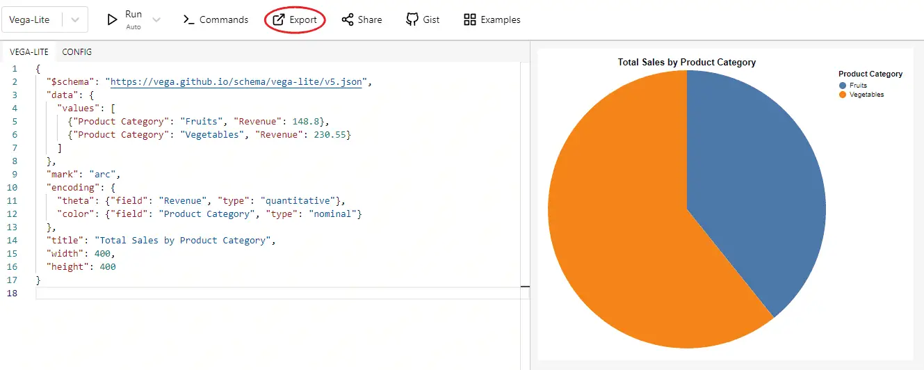
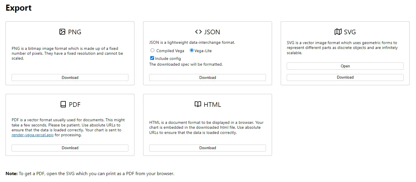
Click “Export” to download the chart in various formats (png, json, svg, pdf, html).
If the chart doesn’t appear after pasting the code, refresh the page.
Next, let’s generate a scatter chart.
Create a scatter plot to explore Product vs Units Sold to identify which products are the best sellers. Use Vega-Lite visualization grammar.
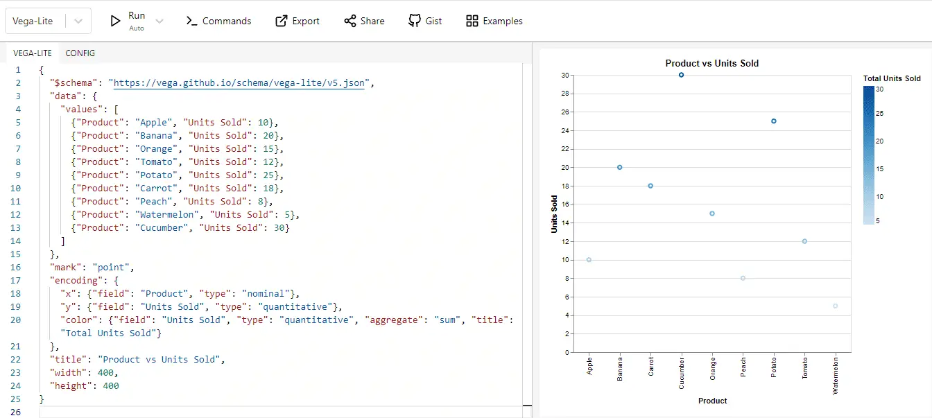
Vega-Lite is a tool for creating data visualizations that is often used by data scientists, engineers and researchers. It can generate a variety of charts, including bar charts, line charts, scatter plots, streamgraphs, box plots, maps, and more.
With ChatGPT, you don’t have to learn its complex syntax. Instead, ask ChatGPT to generate the code in a dialog format. Convenient, isn’t it?
Summary
In conclusion, whether you’re a Plus user with access to plugins like Daigr.am and Wolfram, or a user interested in leveraging the power of Vega-Lite, ChatGPT has solutions to help visualize your data.
These tools demystify complex concepts, turning them into accessible, engaging visuals. Remember, you don’t need to be a data scientist to generate meaningful, informative charts. ChatGPT is your ally in making data speak volumes.